
You must log in or register to comment.
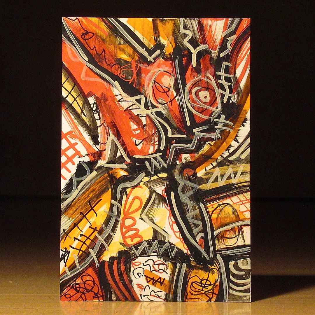
I like the finer line work in this one, it provides a nice contrast to the wider, bolder strokes. Somehow it makes the piece more emotional for me.
Did you give this one a name?
At first glance this looks like a heart (the actual organ). Overall I like the ones where you tend to go for warm colors with this kind of gradient.
Thanks!