- cross-posted to:
- [email protected]
- cross-posted to:
- [email protected]
cross-posted from: https://lemdro.id/post/7531459
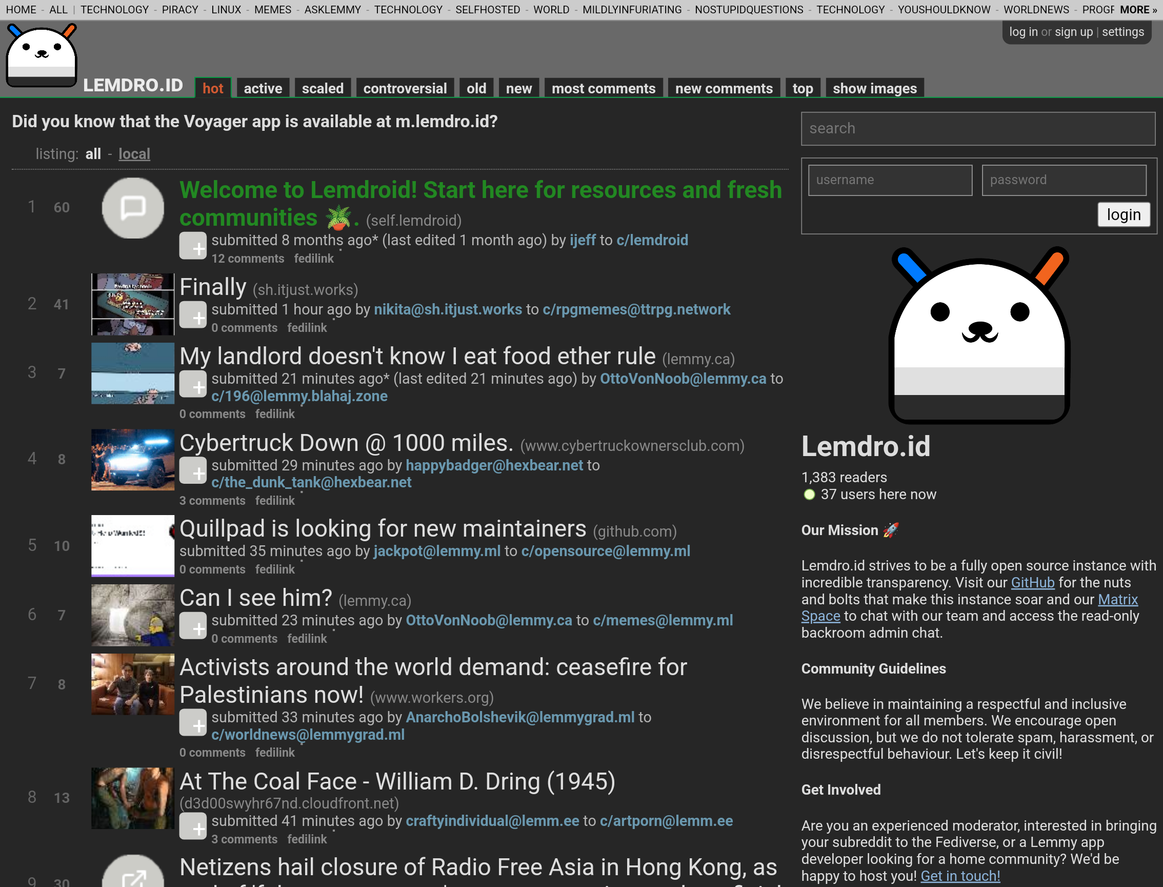
Photon Announces Revamped Design: Introducing Mono-Light
We’re thrilled to unveil a significant redesign of Photon, the user interface for the fediverse! Since its inception, Photon has strived to make the fediverse more accessible with a user-friendly design.
Mono-Light addresses a key request from our community: increased information density. This redesign allows you to view more content at a glance, streamlining your fediverse experience.
Here’s a glance at our new design:
As you can see, every UI element has been streamlined while still remaining beautiful. You can see so much more at once, with no sacrifice to usability. Got fat fingers? just cut a bit of it off.
You can expect this new design to roll out by the end of today, April 1st.
Du coup je sais pas si c’est un poisson ou non hahaha
Poisson clairement ha ha
Moi je ne la trouve pas si moche cette interface. J’aime voir le texte écrit en gros mais aussi les pages bien remplies.
De toutes les façons, je ne suis pas un fanatique des IU. Je trouve l’instance présentée sur la capture beaucoup plus intéressante.Du coup, j’imagine que tu connais celle-ci? https://o.opnxng.com/jlai.lu/?sort=Hot&listingType=Local


