
It would be interesting to see this not including infant mortality.
From my understanding that is where most of the “life gain” in graphs like this have come from.
A graph of how much older people are living would be better represented “ignoring” for lack of a better word the babies dying
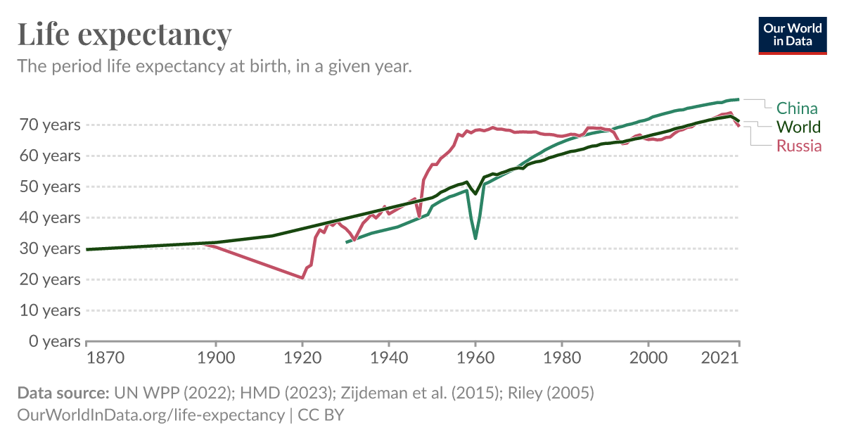
Wow. Mao’s idiotic Great Leap Forward dragged down the entire world’s life expectancy.
What happened in China in 1960? O.o
Central planning mistakes produced too little food(cause they wanted to buy more machines to industrialize quicker) which were later corrected.
That was the middle of Mao Zedong’s disastrous Great Leap Forward initiative, which due to mismanagement saw vast numbers of people starve to death.
But even with that disaster Mao still raised life expectancy more than the world average from 1955 to 1976(when he died).
It’s a little worse than mismanagement:
Mao decreed that efforts to multiply grain yields and bring industry to the countryside should be increased. Local officials were fearful of Anti-Rightist Campaigns and they competed to fulfill or over-fulfill quotas which were based on Mao’s exaggerated claims, collecting non-existent “surpluses” and leaving farmers to starve to death. Higher officials did not dare to report the economic disaster which was being caused by these policies, and national officials, blaming bad weather for the decline in food output, took little or no action.
The government took what food there was from the farmers because they were trying to swing their dicks around and impress the boss. It’s like the Irish potato famine, but with rice.
After nearly a year on lemmy, I’m guessing it was capitalism or maybe microsoft.
I think it was Ubuntu snaps
And now with the US included - https://ourworldindata.org/grapher/life-expectancy?time=1870..latest&country=OWID_WRL~CHN~RUS~USA
Which China surpassed thanks to the idiotic way the USA handled COVID.
I am suspicious of this
So Russia’s death rate was pretty much unchanged from 1930 to 1935 to 1945, and then things got way better in 1950?
Maybe I could see, they are counting only Russia (not the USSR), so the holomodor is largely absent from 1930, and then Russia advances in living standards meant that there was a huge underlying boost that masked the unprecedented deaths during WW2, and then after WW2 the apparent life expectancy shot up because a lot of the vulnerable or old people were already dead. But I don’t buy it. Idk what’s going on with their data, but China looks fine and Russia looks simply wrong; it is missing some big dips that it should have.
Edit: Hm, I guess there is a 6-year divot in 1932… I guess I just expected the Holomodor to show up bigger and less spread out over surrounding years. But yeah maybe it is showing up.
It could be that the death rate was unchanged because child mortality has been drastically reduced through better healthcare. https://www.statista.com/statistics/1041870/russia-all-time-child-mortality-rate/
And there are dips for ukraine but also child mortality fell a lot in Ukraine. https://commons.wikimedia.org/wiki/File:Life_expectancy_in_Ukraine.jpg
Edit: mistyped
Do you think this life expectancy statistic https://www.statista.com/statistics/1041395/life-expectancy-russia-all-time/ is also not right?
That one looks right to me (or, “right” meaning consistently using period LEB) - it’s a little hard to compare because of the difference in granularity but it shows about a 20-year drop for WW2 which is what I would expect.
I edited my comment above; I think what’s happening is that the OP article is mixing different metrics for different parts of the chart. I think this one you’re sending is consistently using period LEB which is why the size of the dips is different.
Odd and sus to include Russia for no particular reason…
Well i included it cause i found it interesting and unexpected given that “Communism killed millions of people” is often said.

