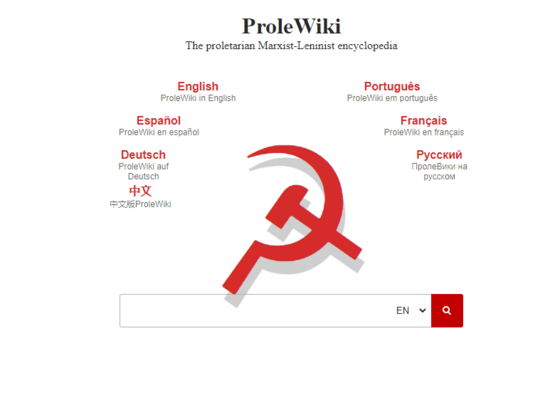
Or see it in action ->> https://prolewiki.org
I feel it’s better than the old one for sure, but that it’s still missing something. Just not sure what.

Well done. Good job.
I feel it’s better than the old one for sure, but that it’s still missing something. Just not sure what.
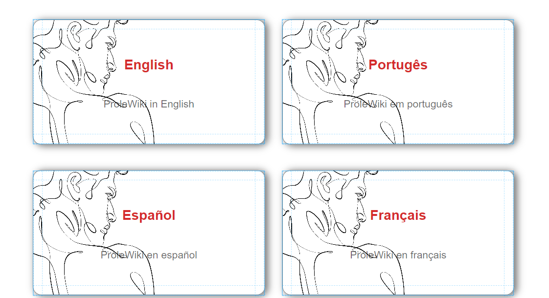
Maybe a pictue of Marx next to Deutsch, Agostinho Neto next to Português, Castro next to Español, etc. Idk, I’m not great at visual design.
I legit started having a similar idea right after posting, this is the mockup with a random pic:

Stay tuned…
great idea!
Love the way the hamsic shadow goes over the input field!
Added a new feature (still using the weird roman statue pic lol for the mockup)
available on the homepage right now, pro tip: you have to keep the mouse button down to have the effect happen. that’s a css quirk alas.


