Hey everyone.]
So update 98/99 has gone live which fixes the crashes (thanks for the reports).
I’m gearing up for a pretty sizable release but just wanted to check in and ask if there was any issues you’re having that I should know about or any new feature requests.
Sorry for the bad comms but I’m making my way through lots of messages and posts on here. Thanks for the patience as I get through these all.
Cheers, Lj
I’d still like to see OpenBoard keyboard get to auto-complete/correct in the title field (and Swiftkey, I’ve heard). I don’t know what’s up with that, but it makes me sad.
The spoiler tags could use an overhaul so they are consistent with the rest of Lemmy. (Obviously handled in the markdown overhaul you mentioned)
Being able to edit image posts, or the titles of posts in the app would be appreciated.
The other thing that’s on my list is the inbox thing. There’s the discrepancy in badges for unread - bottom nav bar gets the badge, but the other views don’t seem to; there’s also the crashing when I change to other views in my inbox if I get there from the left drawer or the top “More Actions” area. (Pretty sure I made issue tracker reports on those.)
Welcome back, LJ! Thanks for all the work you put into Sync - it is such a good interface and user experience overall, and I love it.
(シ_ _)シIs it possible to get ads blocked in the articles that open through sync? I’m not talking about the ones that show up in the unpaid version in the comment section, but rather when you click through to an article, sometimes the sites are so ad-riddled it becomes difficult to read.
The 2 screenshots here are the same link opened through sync vs through firefox
This is the link

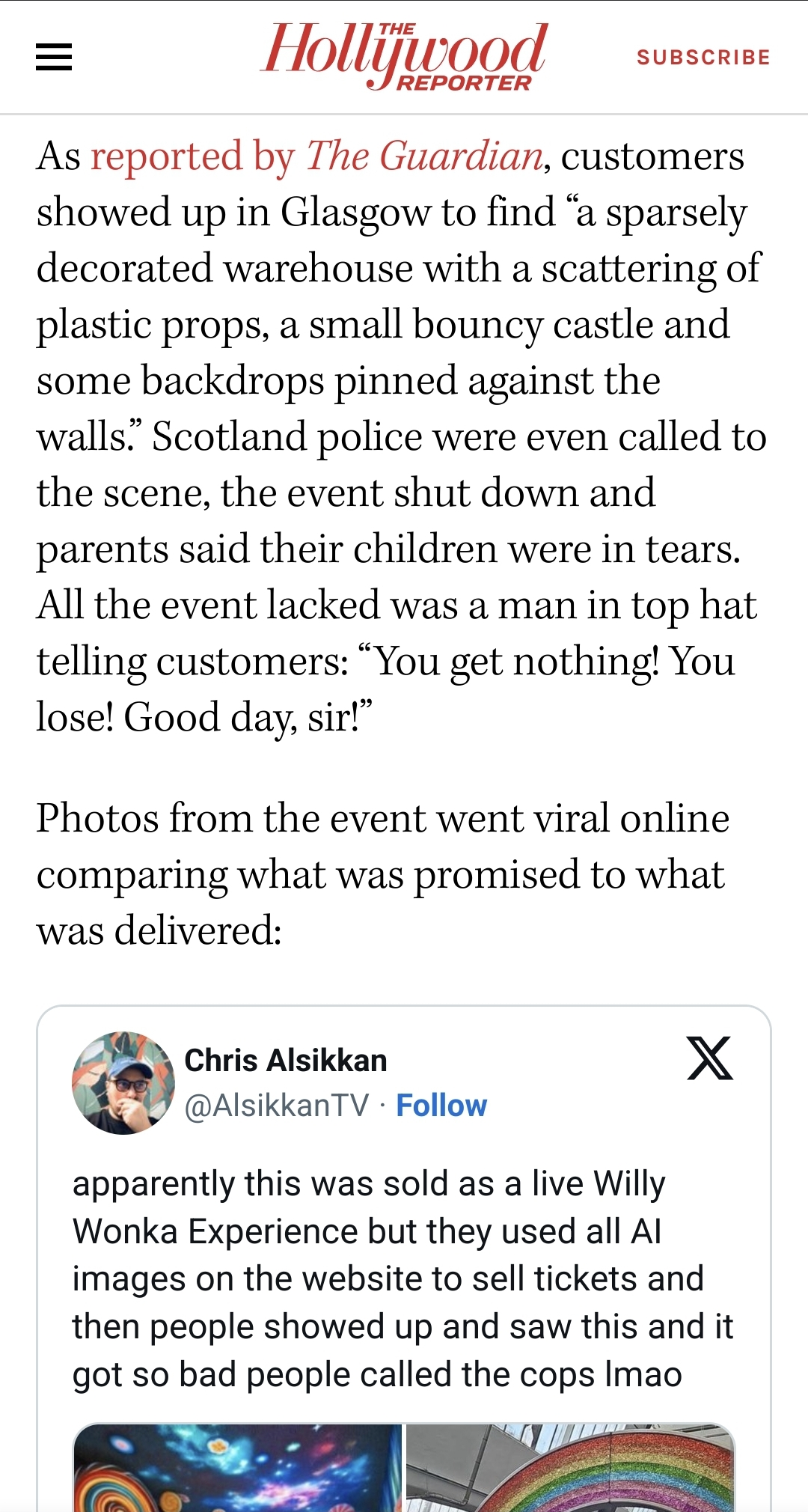
I don’t have this issue… Using Mull as my default browser with uBlock Origin. The webview that opens up is handled by Mull and applies ad blocking.
Have you set Firefox as your default browser and Chrome Custom Tabs in Settings shortcut: Link handling > Default browser
Thank you for making this app 💜💜💜
Thanks for making a great app! I have been satisfied with it and don’t mind slow releases. :)
The only problem as an overall happy Ultra user is when I try to go back from any other sub-page, the previous page sometimes starts from the very beginning as if it refreshed.
For example, when I just browse the feed, then find an interesting community, visit it, come back and I have to scroll the feed all over again. This doesn’t happen every time but only sometimes. Doesn’t feel like ram issue as I’m running S24U, should be capable for that.
Also, automatic skip of “Load next page” would be awesome as I’ve filtered quite a lot of stuff.
Otherwise Sync is amazing, keep it up!
Hmm that shouldn’t be happening. How many “level” down are you going?
Typically not more than one, sometimes it could be two. But it definitely happens with just one level. Usually happens when I’m way too far down the feed, I guess?
Hmm it should be saving its state. I’ll see if I can replicate this!
Well as soon as I just tried to make a recording it stopped reproducing. I’ll try to catch it on vid if possible. Thanks for looking into it and for all your work in general!
(シ_ _)シ
More ads? Seriously?
Yes. Seriously.
I pay, and its worth it, free is never free.

Sorry what is this trying to say?
You linked to kernel.org implying that some things listed as free are actually free. I screenshot the bottom of the kernel.org page that lists the financial supporters of the nonprofit.
I was pointing out that free to you and me is still not free it’s still supported but does not work for profit or sell it’s production as the financial supporters donate their money.
free is never free.
This phrasing is specifically used around the idea of “if you’re not paying, you’re the product.” The kernel is free, in that it costs nothing to use and it does not collect data. Free things still do cost time/effort, which is often equated with money, but those are actually two different things that are being conflated. Now if you’d said something along the lines of “free stuff still costs peoples time,” yeah I’d agree with that, but that’s not what the sentiment your message communicated.
Absolutely no one is going around saying that free stuff doesn’t take effort.
Then pay for it. This is one guy soloing an app in his free time. If you want more features it requires more of his time to work on them and time spent developing this app is time not working his full time job making steady income. We have no right to ask for more of his time for free.
I’m fine paying, but $20 to remove ads is a very big ask for a mobile app, when it was maybe $3 or $5 for the old reddit app. Especially so when it seems he comes and goes and updates to a very in development app have stopped for months at a time.
Don’t get me wrong, I’m not making any demands, I agree with everything you say, but the ad removal option is quite a lot especially when there are many free lemmy apps too.
Glad to see you’re back, LJ, hopefully things are going ok in life for ya.
Hello, I’m a slut and I’d like to be able to upload NSFW pictures again ❣️
I’ll get that enabled again 🫡
Any option about block NSFW content during hours (work) instead of having to toggle on/off?
Multiple images in comments have been pretty buggy, I’ll tap one and it goes to the other image
Do you have an example?
It mostly seems to have issues on the side of images, but some just can’t be tapped on.

Edit: from here though it happens most times there are multiple images displayed together.
edit 2: on s22 ultra if that helps!
I’m missing comment navigation like Sync for reddit used to have, with buttons to go between the root level comments.
Full immersive mode, or transparent navigation bar. Gesture navigation is horrible.
Is that different from Settings shortcut: General > Transparent status immersive setting and Settings shortcut: General > Autohide bottom navigation auto hide the nav bar?
That setting is for the in app navigation bar, not the android navigation bar. I am referring to this:
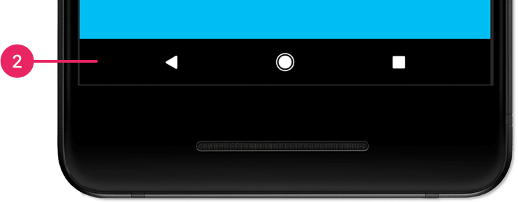
Ah! Ok, I was misunderstanding - thanks for correcting me. That’s one that I can’t help with! It seems like a problem I would try something like an “auto-hide” feature for on my phone, and probably just give up on if it wasn’t there. I’m not good at tech support.
¯\_(ツ)_/¯ 😸Android 10 and below used to have a system wide full immersive mode where you could hide the navigation bar and status bar. They removed the feature in android 11. Samsung phones still support it, but if you use stock or close to stock android, you’re out of luck.
Ah, so maybe that’s what I was thinking of with my “search my phone settings” approach…
¯\_(ツ)_/¯It would be nice in the immersive interface situation, as you had mentioned in the first place! Thanks a lot, now I want that feature!
:-P
My app still crashes if I try to view my messages inbox :(
Everytime? Not seeing this coming through
There’s a thing where if you go to the inbox from the left drawer, and change your … page? View? From, for example, Unread Replies to Mentions, or whatever, and it crashes every time. Also the More Actions inbox is like that.
Edit: just tried again - left drawer inbox, go from All Replies to Unread Replies, crash.
Edit 2: found the GitHub issue about it: Issue 446 if anyone else wants to add info to it.
I’ll add another feature request that I forgot: instance browsing. Being able to see a list of communities within a remote instance would be nice (preferably sorted by subscribers like in the web UI). Being able to see the Local feed from a selected remote instance would also be useful. I think both those features could help with community discovery.
Is that different than using the “instance” button to go to (for example) lemmy.world and then the “communities” button to bring up this list:
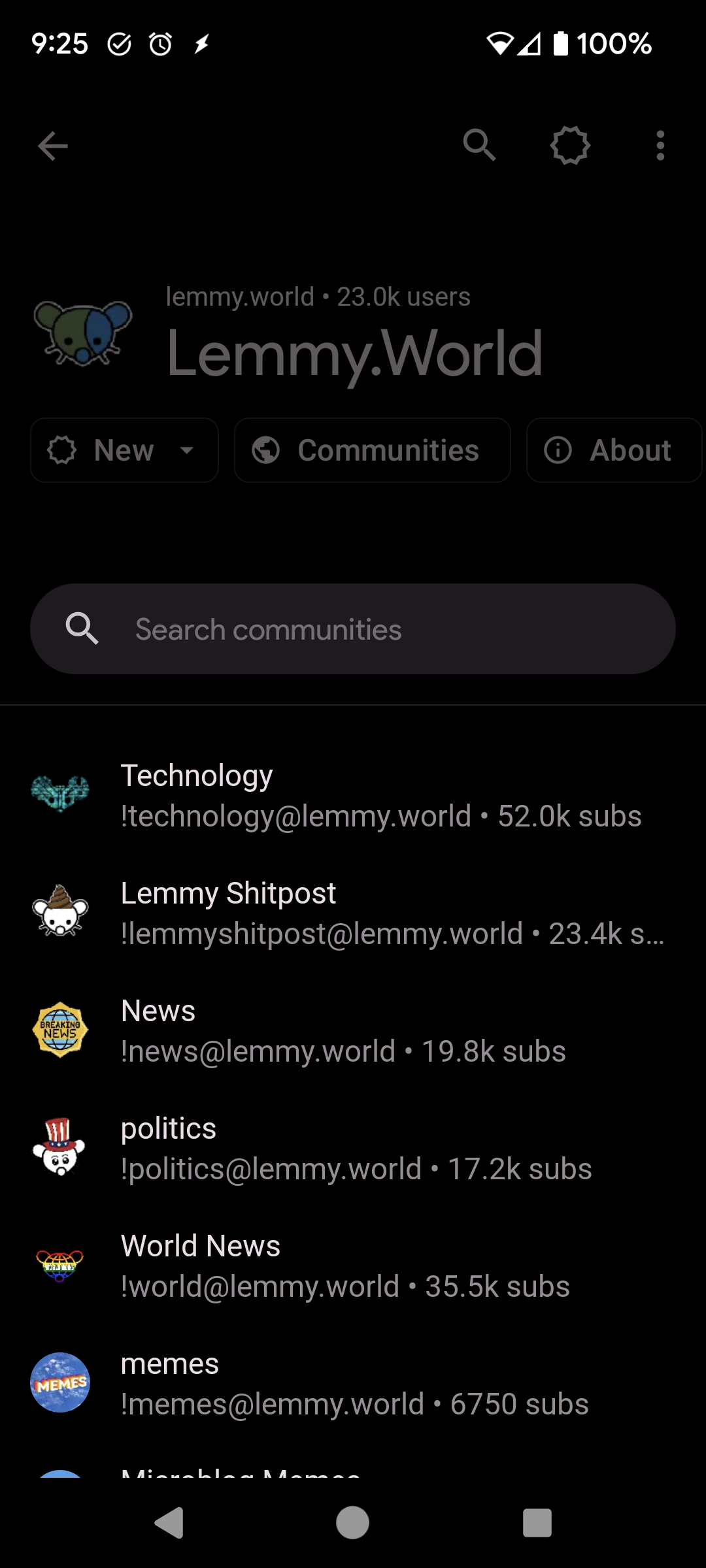
(Edit: I see that my pic isn’t all sorted by size, and that’s a difference, but I’m genuinely curious about other ways to browse other instances since I’m basically alone on mine)
EDIT: I was apparently blind to the instances button dear lord.
Being able to see communities on an instance sorted by size like the web UI would be nice, though, still.
That’s fair 😁
So where is this instances button?!
Right on top of your feed.
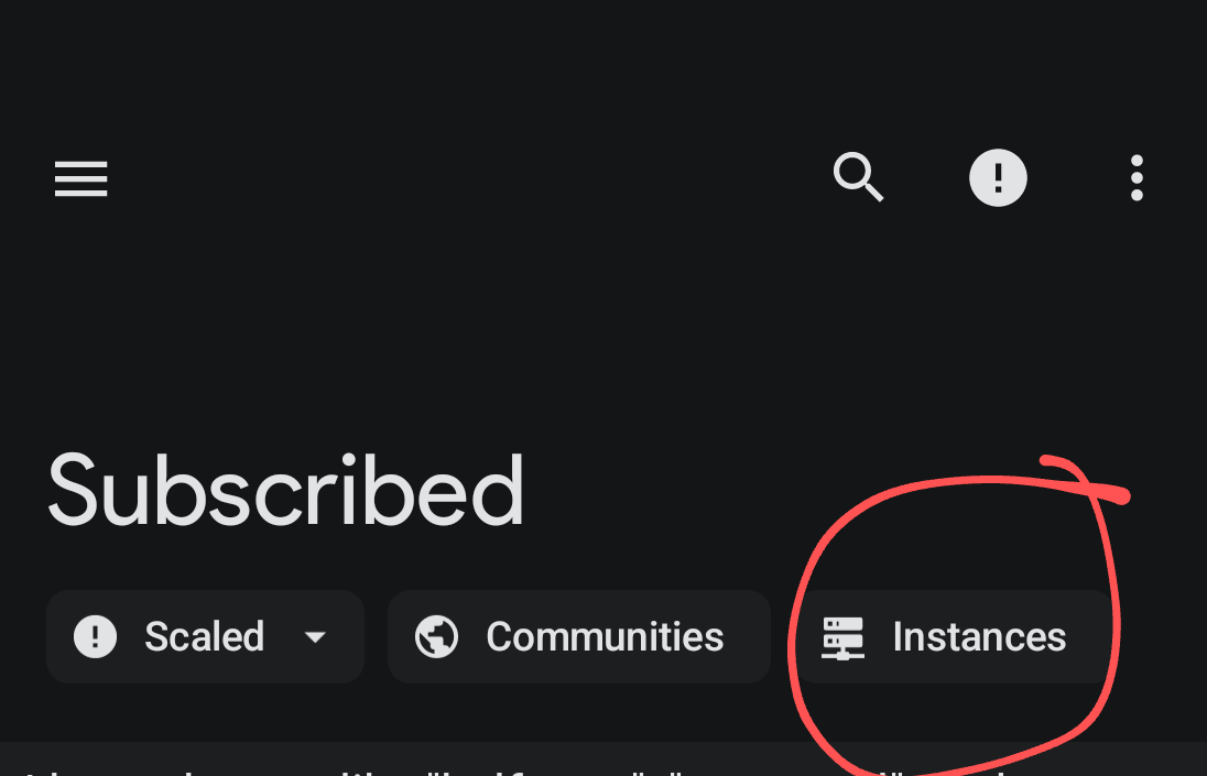
Thx
Find it? (New comments aren’t highlited yet, so I didn’t notice this)
There’s also one in my More Actions menu (the 3 dots in the upper right)
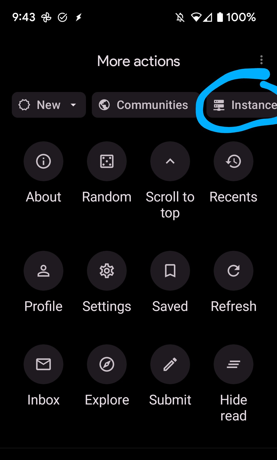
Thx
Did removing NSFW posts go away? When I look at my filter options I see that I can blur previews and such, but the option to have them completely blocked went away. Or maybe it moved?
Looks like it moved:
Settings shortcut: Account settings > Show NSFW contentWhoa didn’t know you could link like that. Thank you!
Yeah, it’s great! Just long-press any setting and it gets copied - I love this feature! (งツ)ว You are welcome!
Is there a way to make “deleted by user” stand out more as a system message? The current styling makes it look like they literally commented “deleted by user”


