You aren’t right about this. Surely you can read a line graph… I have index funds that closely track the market as a whole and they are way down compared to even before the election.
Right, and I can see that. But if you back out that line graph over a longer period of time, this dip would be miniscule compared to the overall upward trajectory. If the Y Axis tracking the market starts at 0 (which it wouldn’t I get that, but go with me here) and the X axis tracks time and we set it to say, a 3 year period - then the result is that the line has exploded upwards. The tiny tip at the end which represents the last 6 months barely registers. The average closing price in 2023 was 34,121. The close today was 42,454. So even if the market has dropped significantly in the last few months - it’s 25% higher than it was 2 years ago.
Again, I trust that people know what they’re talking about. I am certain I do NOT know what I’m talking about. I am not saying I don’t believe them, or that I’m right - I just want someone to explain the factor I’m missing. I have theories, but no way to confirm them because I lack the base knowledge to even phrase the question right.
Is the stock market supposed to have a “default growth” element that we have to account for? Like, is the fact that the market twice as high as it was 3 years ago an illusion because constant growth is just a necessary element of the market functioning at all? Does that default growth make longer timelines less useful as comparative tools?
Or is it that more that the market was projected to grow and then shrunk instead, so the relevant comparison isn’t to history, but to projections, which is why even a small dip seems more catastrophic? Because it was supposed to continue skyrocketing.
Or am I asking the impossible? Does gaining context for the larger momentum of the stock market take a degree in finance and by asking for someone for a simple explanation I’m just further showing my ignorance?
The way I interpret that graph of the last 5 years is that at only a couple of points in time did any drops as steep or as large occur except during covid times (exacerbated hugely by Trump) and once in 2023 which I’m not sure what happened but it was a slower fall and the recovery was very strong.
Then funny enough I stumbled on this image (I had saved from a couple weeks ago) when I took this screenshot to show you:
I don’t find it fair to say it only is significant because it’s not visible on a 90 year graph. Times change a lot over decades. Even if you only look at 20 years back, this is a blip you can see and it’s only a couple months in.


You aren’t right about this. Surely you can read a line graph… I have index funds that closely track the market as a whole and they are way down compared to even before the election.
Right, and I can see that. But if you back out that line graph over a longer period of time, this dip would be miniscule compared to the overall upward trajectory. If the Y Axis tracking the market starts at 0 (which it wouldn’t I get that, but go with me here) and the X axis tracks time and we set it to say, a 3 year period - then the result is that the line has exploded upwards. The tiny tip at the end which represents the last 6 months barely registers. The average closing price in 2023 was 34,121. The close today was 42,454. So even if the market has dropped significantly in the last few months - it’s 25% higher than it was 2 years ago.
Again, I trust that people know what they’re talking about. I am certain I do NOT know what I’m talking about. I am not saying I don’t believe them, or that I’m right - I just want someone to explain the factor I’m missing. I have theories, but no way to confirm them because I lack the base knowledge to even phrase the question right.
Is the stock market supposed to have a “default growth” element that we have to account for? Like, is the fact that the market twice as high as it was 3 years ago an illusion because constant growth is just a necessary element of the market functioning at all? Does that default growth make longer timelines less useful as comparative tools?
Or is it that more that the market was projected to grow and then shrunk instead, so the relevant comparison isn’t to history, but to projections, which is why even a small dip seems more catastrophic? Because it was supposed to continue skyrocketing.
Or am I asking the impossible? Does gaining context for the larger momentum of the stock market take a degree in finance and by asking for someone for a simple explanation I’m just further showing my ignorance?
The funny part about this is that I feel even more validated when I check a live updates graph of the s and p 500.
See for yourself: https://www.macrotrends.net/2488/sp500-10-year-daily-chart
The way I interpret that graph of the last 5 years is that at only a couple of points in time did any drops as steep or as large occur except during covid times (exacerbated hugely by Trump) and once in 2023 which I’m not sure what happened but it was a slower fall and the recovery was very strong.
Then funny enough I stumbled on this image (I had saved from a couple weeks ago) when I took this screenshot to show you: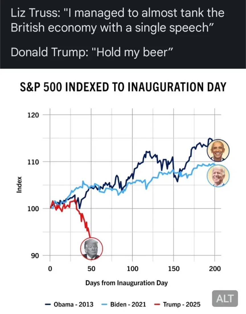
I don’t find it fair to say it only is significant because it’s not visible on a 90 year graph. Times change a lot over decades. Even if you only look at 20 years back, this is a blip you can see and it’s only a couple months in.
https://www.macrotrends.net/2324/sp-500-historical-chart-data
If you look at this data and don’t see it, I don’t know what to tell you.