
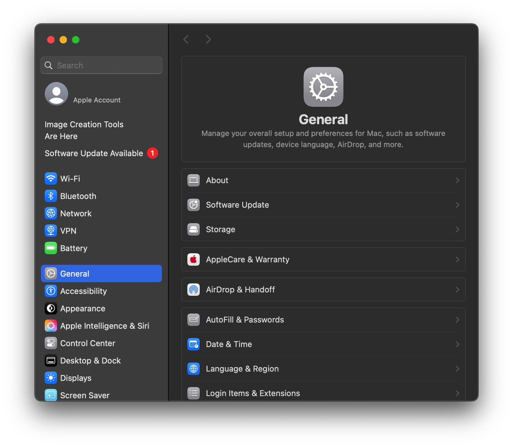
The image on the right is how the settings app look on macOS 12. On macOS 13 (2022) it was changed to look more to the one on the left, with all the sections selectable in a sidebar and a smaller window. Many users have complained about it, saying that it sacrificed function for form and is part of making macOS more like iOS by mindlessly copying phone UIs onto computers which it isn’t meant for. I think its alright, not terrible. And it’s the norm with settings apps looking like that in Windows, KDE, Gnome, and some other DEs.
I’m so much more used to the left that I absolutely do not like the right at all. Side note: it’s why I absolutely disliked default Gnome when I was first using Ubuntu: programs set up similarly to the right in the start menu adjacent thing.
The new settings app in macOS is a ridiculous wall of text. So I prefer the one on the right.
Left. Left. Absolutely left, oh my god.
if i could choose, i would get the left, but right is fine too
I much prefer the one on the right. Sure, it looked a bit less modern but it wasn’t nearly as glitchy as the newer one. I rely on searching for settings and it almost never works; I really don’t know how Apple ever let the new version into macOS.
OP is just talking about layout, not implementations.
Well the layout of the search in the new version also completely fucking sucks since at least in the old layout it would highlight the section you needed to go to.
@TheTwelveYearOld
Left.The left. It’s far superior.
I prefer chaos. I have it place windows in a randomly generated location, and set at a random window size (if the app allows it). 😈
The right was fine, honestly. At least on macOS, the new “modern” version is an utter clusterfuck. As for complaints about being unable to pick a different option when one of them is open, in macOS you have a View menu with all of them available to select from on either one.
Having said that, a list/search area to the left of the panel is probably preferable if done properly.
The grid on the right just shows you all your options.
The list on the left obscures some of your options behind a scroll down, which you will then realize you actually have to scroll back up for!
Fun fact: KDE’s settings app used to look the one on the right up until a few years ago, too.
@Ephera @TheTwelveYearOld And Apple’s doesn’t look like that anymore either. It looks more similar to @kde’s app now.
I prefer right for browsing.
Though, I use search to find the setting I’m looking for 99% of the time, anyway.
Left.
Left, definitely.
It’s way less chaotic and more neatly organized. Much easier for me to find what I’m looking for.
I use KDE for technical reasons, but I pretty much prefer Gnome’s settings and generally their whole UI design.
Speaking of the image, I prefer KDE’s settings. Apple’s is too dumbed down and slower to navigate.


