A spectrum is usually drawn similar to the one on the left. But the point of a spectrum is that its not “where on the spectrum are you”… It is not one point on the spectrum. As drawn on the left, the spectrum represents possibilities. Normally a spectrum would be drawn to indicate how much of each possibility a thing covers.
Eg, the spectrum for light emission of a lamp might be :
Which means it has a bit varying of every color but is heavily green and orange, but probably looks just like white to the naked eye. Swap “green” for “language” etc and you have a spectrum.
Theoretically, it can be a single point regarding the reference unit (here, the colour). Consider ideal laserlight for example, there you have just one specific wavelength, i.e., a single colour. The magnitude might differ, but it would be a single point in a mathematical sense.
A spectrum is usually drawn similar to the one on the left. But the point of a spectrum is that its not “where on the spectrum are you”… It is not one point on the spectrum. As drawn on the left, the spectrum represents possibilities. Normally a spectrum would be drawn to indicate how much of each possibility a thing covers.
Eg, the spectrum for light emission of a lamp might be :
Which means it has a bit varying of every color but is heavily green and orange, but probably looks just like white to the naked eye. Swap “green” for “language” etc and you have a spectrum.
As an engineer, I concur.
Although I would make one adjustment:
Theoretically, it can be a single point regarding the reference unit (here, the colour). Consider ideal laserlight for example, there you have just one specific wavelength, i.e., a single colour. The magnitude might differ, but it would be a single point in a mathematical sense.
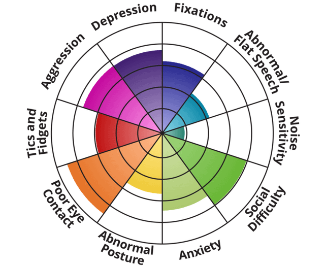
Aren’t the OP circle spectrum supposed to be filled out like this:
Edit: I do agree the linear spectra can (and obviously do) look like what you posted.
Also I just searched circular spectrum to find the one I posted. I neither agree nor disagree with it. I didn’t actually read where it came from.