- cross-posted to:
- [email protected]
- cross-posted to:
- [email protected]
 0·2 months ago
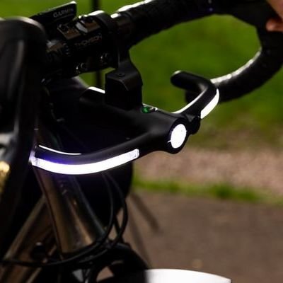
- Most of the website area is dedicated to photos of a finished product, like you would expect from an ecommerce site.
- Most of the text just sells the product, instead of explaining reasoning like how this is safer.
- The camera on the light has nothing to do with visibility.
 0·2 months ago
- Wait, long running design blog offers visual orientated content and is subsequently suspicious.
- It’s talking about a product that’s still a Kickstarter project, what do you want?
- I don’t even know what to say about your third point, it’s just ridiculous.

