Removed by mod
Nah there were definitely games that had disappointing graphics relative to what I was expecting lol
Although it’s true, we generally were more forgiving about graphics back then than we are these days.
The Wizard lied to me for 2 hours about that useless piece of plastic.
Dude, the guy who introduced it in the movie straight up said “it’s so bad!”
Which meant “it’s really really really good” at the time.
Which was late '80s early '90s slang for “it’s the best.” I had to double check the scene, but yeah, that was slang.
But if you would have saved it until today you could resell it foe a whole $25 more (of course accounting for inflation it’s actually $105 less)
…
Wait is that true? Did a rare Nintendo product depreciate in value???
It was a mattel product
Box art back then was more akin to book cover art: an artist’s interpretation of the content. It never disappointed me. I even miss it sometimes. I used to collect images of box art even without the games, because it really was art.
When I give a digital game as present I go to the shop to print out the cover art on photo paper and then put it in a card. It gives them something they can immediately look at, handle, and discuss.
Here are a few I’ve used recently, they are more literal than the cartridge era but they are still artworks in their own right:


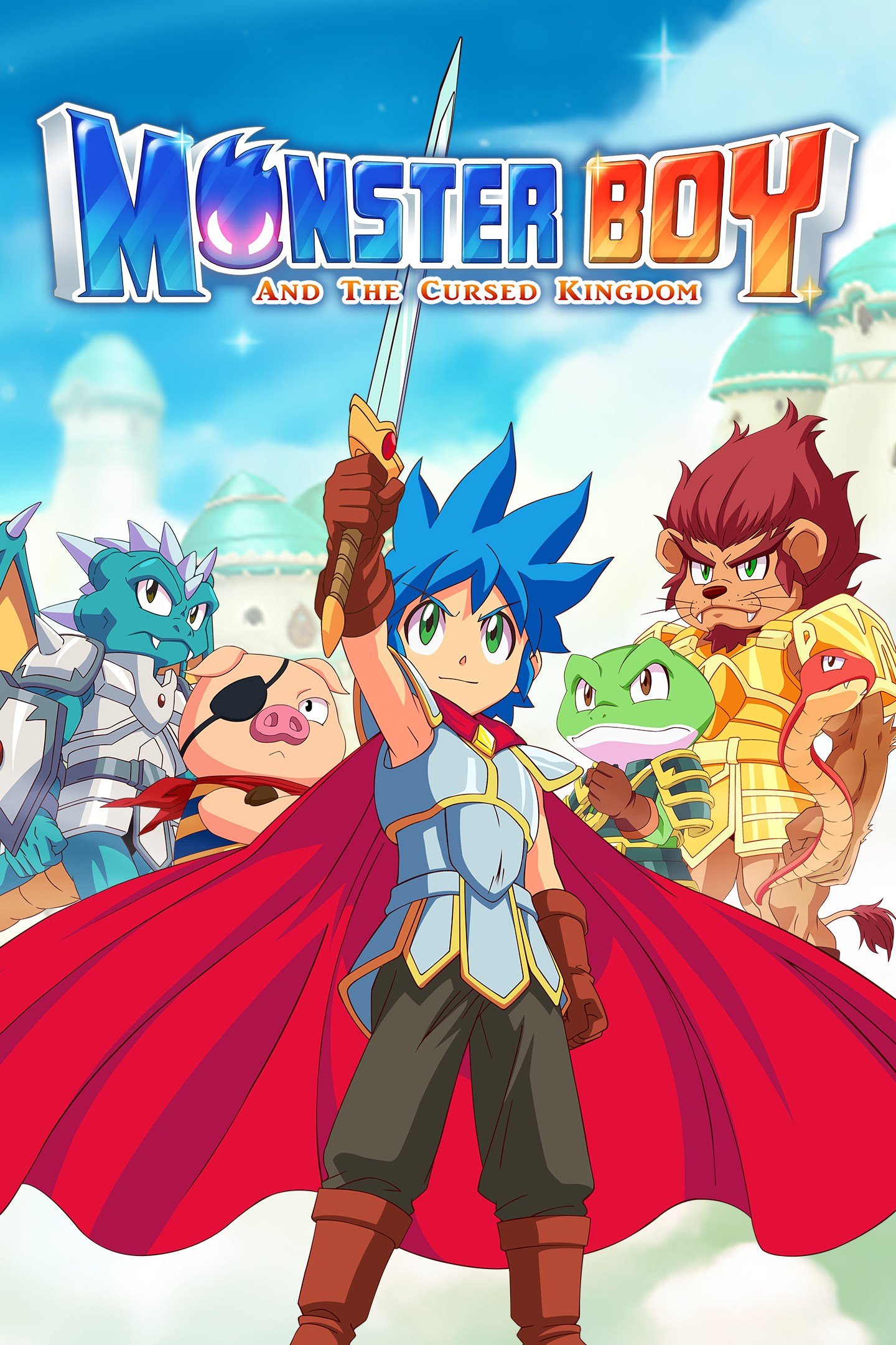
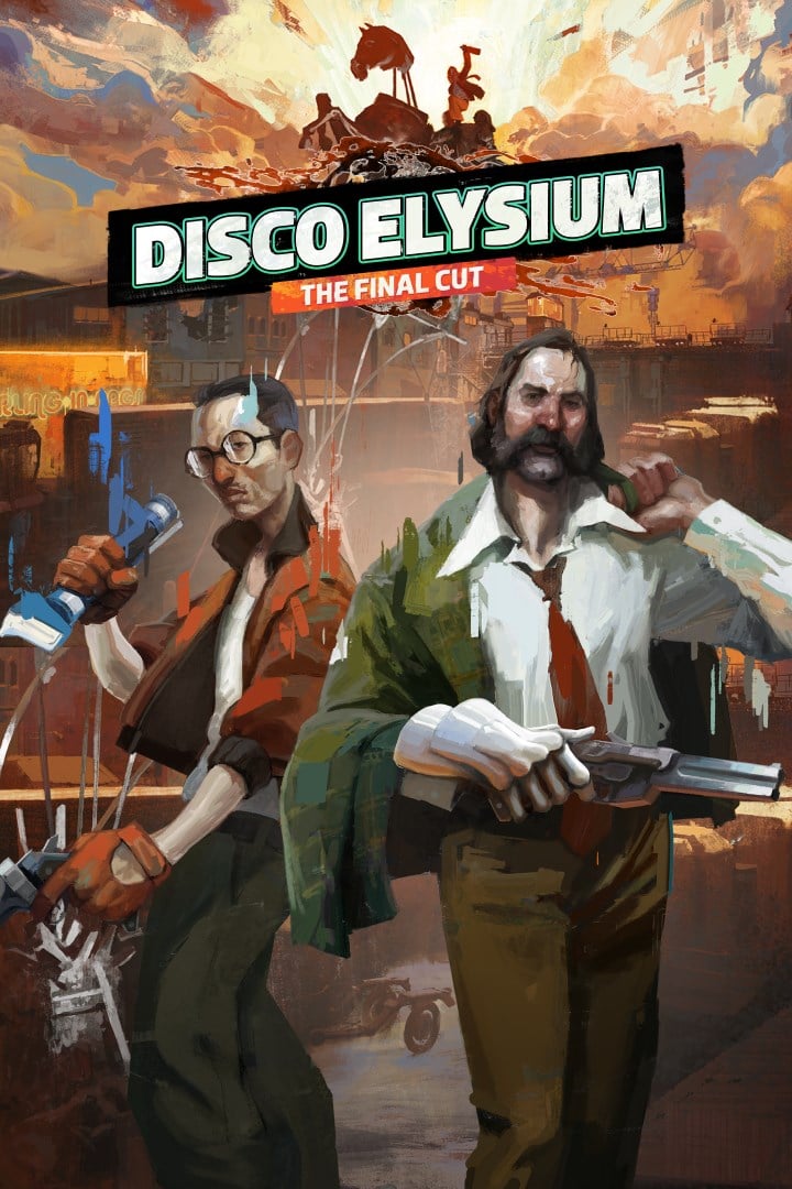
Mario 3 was the most mind blowing leap in graphics I think I’ve ever experienced.
I’m gonna press X to doubt on that one.
No, he’s right. The power glove was garbage from the get-go. Really cool cyberpunk thing on paper but … hell, we still aren’t there today!
We absolutely could be “there” today but the lingering aura of the Powerglove is still so powerful that nobody has tried to make a better one. It got clowned on so hard the first time that the echoes of that are still rippling through our global subconscious 35 years later.
Also, Nintendo would probably try to sue you if you sold a glove-based controller, even 35 years later.
I’d argue that haptic gloves, valve index controllers, and hand tracking are there, but the hardware for VR isn’t quite cheap enough for it to be mainstream.
We’re beyond that today…
The power glove was essentially a Wiimote. It has a 3 point sensor bar you had to hang on the TV, and used audio signals to get the location. Technology improved & we ended up with the Wiimote and the Kinect, then decided that the motion controls were dumb unless VR was involved and that’s where all the innovation went.
Even if it worked well, the idea was bad from the start. No one wants to control a game with motion controls.
I dunno, Wii seemed to manage it just fine.
No X button on the controller. Just A and B.
Touché.
The game in the example is Bad Street Brawler which is every bit as terrible as portrayed. I have it somewhere still. Could never get past like thr second level.
It’s the same with lots of indie games now. Oh, and mobile ones too
Back in the day, deep down you knew what you were really getting. I’m a little annoyed these days when indie games use marketing visuals that look like they could be in-game for a modern title and then it’s all pixel art style. I get that you don’t make a pixel art poster, but in that case, go all-in on an art cover don’t let it be mistaken for game graphics.
The first game that always comes to my mind in that regard is Super Time Force Ultra. It kept showing on my steam page for weeks on end years ago, with a cartoony-looking cover and “minimalistic pixel” style for actual gameplay
Bro, that stupid game with the guys that shoot barrels to get more fighters/better weapons looked fun. The actual game is a shitty base builder with timed progression, of course you can pay to get past the time locks. Fuck that company and every “influencer” that takes their dirty money.
I mean, from the ad it could be any of 4123984716239 shitty games on the play store. The last one ad I remember using that was Evony, which I’m surprised still fucking exists. That piece of shit has been a meme since 2010
LMAO, I got super into Evony. Even coded a bot myself to run my rogue base 24/7 so my guild could attack it for massive loot. I totally got suckered by their ad. That was like 2008/2009.
Back when XBLA got going there were so many games with anime character art that ended up being meh side-scrolling platformers with 8-bit pixel graphics. Looking at the Nintendo eShop… not much has changed. 😄
ahem…
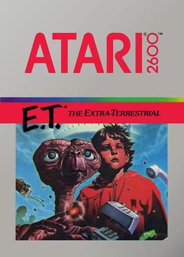
That’s the masterpiece that helped kick off the new age of gaming!
I remember renting Phalanx just because of the box. like “why’s this old man playing the banjo?” then you look at the back and it’s a friggin space shooter. I had to rent it.
I was always so disappointed in the 90s to see ‘realistic’ looking graphics and then you play the game and realize it was just a point and click game
Everyone always praised Myst for its great graphics. I always thought it was cheating because it was pre-rendered.
Even being prerendered, it was an intensely impressive game for 1993.
And it’s not like they didn’t have plenty of problems to solve.
Here’s an interesting interview with founder Rand Miller about developing Myst and how they were barely able to make it work due to the limitations of CD drives.
LOL, that quicktime butterfly animation on the main island was hot shit back then.
Lots of the best games were prerendered! Donkey Kong Country, Fallout, Jagged Alliance 2, Duke 3D, the Pro Pinball games, just to name a few.
I do have a soft spot for prerendered graphics.
Technically the monsters in Doom, too.
Most things in Doom, if we’re counting photos!
BioForge was particularly impressive for the time, with mixed pre-rendered graphics.
I am not sure prerendered describes ja2 and fallout (some of the best games tbh). Aren’t those just sprites?
The rest I have not played.
Prerendered sprites by taking screenshots of the models on their single expensive silicon graphics.
The characters and environments in Fallout and JA2 are basically still frames (sprites) of 3D models at specific angles. They were rendered once on a powerful development machine, and converted to sprites for our lowly Pentiums and Voodoos.
Aren’t all sprites prerendered? What is the alternative, hand drawn ones? That would go waaay back…
It wouldn’t really. Hand-drawn sprites are pretty standard even today - whether they’re hand-pixelled (Stardew Valley) or frame-by-frame animation (Spiritfarer).
Sure it was pre-rendered, but it was still impressive to see PCs do that at the time because of the sheer amount of storage it took. Myst basically required a CD-ROM drive because the game is basically made of pictures, PCM audio and video. There’s an astonishing amount of video in that game from the early 90’s. It was another symptom of CDs having an astonishing amount of capacity for their era. Myst couldn’t exist on floppy disk.
It is pretty cool to see what they’ve recently done to Riven. They really brought it to life in Unreal Engine.
What’s even more impressive is Myst was made on a Mac using slides.
Oh shit, I forgot about that. Myst was the crowning achievement of HyperCard (which is still superior to PowerPoint, BTW).
Yes, HyperCard! Thank you.
I used to use it to make animations on my black and green Mac III.
Myst was published in what? 1993? Digital cameras were not common at the time. It was kind of cool just to see video of a person on a computer screen.
there were engineering competitions in the late nineties for realtime rendered games. they tended to look like vetrex games.
Speaking for myself but in 1995 or whatever I didn’t even know what the term rendered was. Game looked cool but I liked Tex Murphy Under a Killing Moon for state of the art graphics lol
It was, though the difference was how early that game came out and the volume of images it had. It was pretty huge!
The novelty died out quick though, as everyone else started prerendering stuff.
There was a bunch of games that had really detailed graphics in the screenshots. Then you’d play them and realize they’re prerendered. A bunch of Saturn games were guilty of that.
Final Fantasy. Flowing dramatic artwork. 18 pixels of character (hyperbole, idk the actual pixel number.)
The character sprites were 16x24 in combat, so a whole 384 pixels to work with!
A 386 could handle that easily and still have two pixels left.
Gonna make good use of those 33Mhz!
Sometimes I forget that CPU clock speeds were talked about in Mhz instead of Ghz.
And not even hundreds of MHz till the 90s.
I still remember swapping out my 486 SX 33Mhz with a 486 DX 100! I could finally play Duke Nukem 3D properly. Some areas got down to a frame every 2 seconds with the old processor.
I couldn’t even launch Duke on my 386, so I only played Doom with viewport shrunk to almost the smallest size. It ran pretty well like that.
I was playing the 20th anniversary edition recently and they have developer commentary built into the game with little activated speech bubbles spread throughout a few levels. It was neat hearing them talk about how they targeted 20fps from a certain location on the map for a 486 SX 33, so to reach that they deleted a few pixels here and there.
To be fair, I’ve never seen anything come close to Amanos illustratative work.
I decided to play Crystal Warriors recently because of the awesome cover art. DUDE I WAS NOT DISAPPOINTED. That game rules!
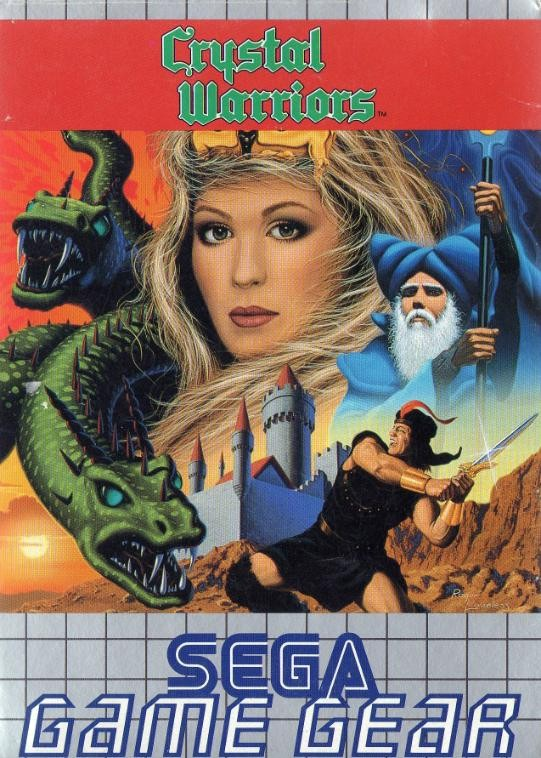
I’m reading this game’s wikipedia page and it sounds very fun. What a shame it’s stuck on the game gear and the now nonexistant 3ds eshop. I hope Sega does another re-release. Not that it matters to me 🏴☠️.
I can’t research it at the moment, but I want to say that was a common thing in the pre-NES days, and I think Nintendo required actual gameplay graphics to be shown on the box because of that.
Could be off on the specifics, but I do vaguely recall those kinds of non-representative box art having some controversy.
Nintendo of America often used pixel art for their own box art early on in the NES era. It was similar to the in game graphics, but usually more detailed. See Metroid’s original artwork. If there was a requirement for third parties, perhaps it could be met by simply including screenshots on the back.
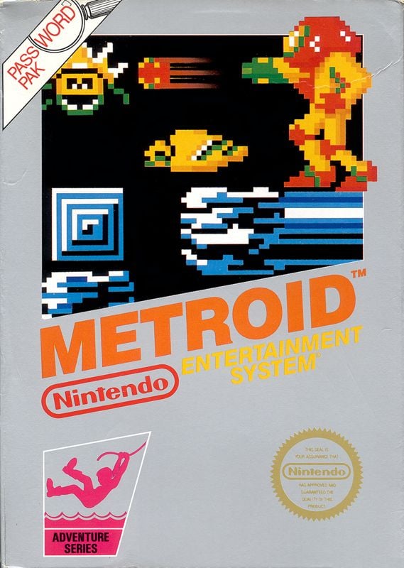
the back usually showed gameplay shots.
Yes, where they put the superior Amiga screenshots on the back of your ZX Spectrum game
Lol how was that allowed? It’s a complete different version.
If you think it’s an unregulated mess now, take a look at the home computer scene in the mid-80s. Absolute wild west, dude.
In today’s gaming envoriment large companies can make promise after promise, deliver on none of them and walk away like nothing happened. The worst thing that can happen is some people calling you bad names online. What makes you think advertisement would be more ethical at a time no one gave a shit about gaming?
The scene was too small back then for anyone to pay attention. Most microcomputer developers were selling games out of their garage via mail order.
Holy crap that’s Bad Street Brawler. I have this game still. It’s straight up the worst game I’ve ever played.
To think all you had to do was wait 2 more years for River City Ransom to come out. If only precognition was real.
I’ve just played the first level on a Spectrum emulator.
I have no real wish to play the second.
The name really does say it, it’s a bad street brawler.
Uh…bad street brawler was amazing
I had Bad Street Brawler for the NES and it’s so bad, it’s funny. Even back in the day… fighting midgets, dogs, and circus strongmen, trying to get to the dumpster at the end of the level, and with 2-player coop to boot
I somehow missed Bad Street Brawler and went for Bad Dudes because I played that one at the arcade. Wasn’t nearly as good as the arcade version though.
Aka. Bop’n’Rumble for Commodore 64.
It wasn’t all bad. The gameplay was alright.
It was Street Hassle as well I think.
Only ever saw a few screenshots in a ZX Spectrum magazine, but it certainly has a memorable art style.
I 💯 went through this disappointment. I used to also love looking at a game’s concept art because they always looked so much cooler and atmospheric than the game. I remember the inflection point clearly. I was playing Mass Effect 3 and walking around the citadel wards/docks, with it’s beautifully detailed textures, evocative colours, and painterly lightshafts, feeling absolutely enthralled, and thinking “Holy shit, they’ve finally done it, the gameplay looks better than the box/concept art.”
I’m so glad I finally got around to playing the ME series. Such a memorable trilogy of games
Honestly graphics aren’t really that important compared to the gameplay. Games such as those in the UFO 50 collection are a really good example of that. Also if you actually want a quality god vs satan game with old school graphics then I highly recommend Grimstone.
UFO 50 is so damn good
My games were all pirated. Covers had a handwritten list of all games on the cassette (and later CD). The first legit game I’ve ever seen was Mortal Kombat Trilogy and I remember being taken aback by the waste of using a full CD for a single game (iirc the game used just 30 MB of space on that CD).
10s of MB software with the rest of the disc as CD audio was standard for the time.
Even with those constraints PS had noticeable mid-battle lag as it loaded in animationss.


